I use this site as a laboratory for all my performance related experiments. I go to great lengths to make sure this site and the blog posts are as performant as possible. The biggest obstacle in this is the size of images. The solution to this is using responsive images via picture tags.
There are two ways to achieve this:
- Improving the responsive images feature of lego. This itself can be done in two ways.
- Generate the images and add them to source control. This will lead to an increase in the repository size and will also be a maintenance nightmare if I need to change an image.
- Generate images on the fly during the build process. This doesn't have the issues of the previous approach but will lead to an increase in cold build timings.
- Use a service like Cloudinary and offload these issues to a third party.
On closer analysis, it looked like Cloudinary was also doing a whole lot of other stuff and it seemed promising. I was, however, put off by the pricing. While looking for open-source alternatives, I came across thumbor. To be frank, I was surprised that something this powerful was open-sourced.
This website now uses thumbor to serve responsive images and to also serve images in the webp format when supported by the browser. This is a rough outline of how this is implemented.
Setup
I installed thumbor on an f1-micro instance on GCP. This comes with 750 hours of free usage limit per month. GCP also provides a $300 credit for 12 months and this should be more than sufficient for my use case. I initially tried doing this on AWS but for some weird reason, I was never able to SSH into my newly spawned instance. The troubleshooting guide didn't make any sense with too much fancy AWS jargon and I just abandoned it after another friend faced the same issue.
I started multiple instances of thumbor because I was worried that having just one instance might not be sufficient when more than one image is being loaded at the same time. This is the supervisord configuration(with 4 thumbor instances).
[supervisord]
[program:thumbor]
command=sudo /home/siva/.local/bin/thumbor -p 800%(process_num)s --conf="/home/siva/thumbor.conf"
process_name=thumbor800%(process_num)s
numprocs=4
autostart=true
autorestart=true
stdout_logfile=/home/siva/log/supervisor/thumbor800%(process_num)s.stdout.log
stdout_logfile_backups=3
stderr_logfile=/home/siva/log/supervisor/thumbor800%(process_num)s.stderr.log
I put this behind nginx that acts as a load balancer.
One important thing to note here is that, thumbor is pretty vulnerable to URL tampering that can end up overloading the server. To prevent this, they have a solution based on hash-based message authentication code. However, since the images on this site can keep changing and hooking into the build process and generating a hash for images and using that as img srcs is too complicated, I decided to go with an alternate approach. thumbor supports loading images with /unsafe instead of the encoded_signature. However, anybody will be able to manipulate any image and overload the server with this approach.
One way to limit this is to use the ALLOWED_SOURCES config of thumbor.
import re

ALLOWED_SOURCES = [
    re.compile(r'^https://siva.dev/.*'),
    re.compile(r'^.*agitated-bohr-630337.netlify.com/.*')
]
What this does is that, it only supports images that are present on these domains. For example, thumbor/unsafe/1400x700/https://siva.dev/static/images/tiger.png will work whereas thumbor/unsafe/1400x700/https://another.dev/static/images/tiger.png will not work. It might also be prudent to put the same restriction at the nginx side as well.
I also decided to use just two image resolutions on this site: 1400px on desktop and 700px on mobile. Since there is no way to configure thumbor to do so, I simply put this on nginx.
http {
  upstream thumbor {
    least_conn;
    server 127.0.0.1:8000;
    server 127.0.0.1:8001;
    server 127.0.0.1:8002;
    server 127.0.0.1:8003;
  }
  server {
    listen       80;
    server_name  localhost;
    location ^~ /unsafe/1400x/ {
      proxy_pass http://thumbor;
    }
    location ^~ /unsafe/700x/ {
      proxy_pass http://thumbor;
    }
  }
After this, I pointed one of my subdomains at the public IP of my GCP instance. I also configured Cloudflare so that a request for an image only hits my server once. Subsequent requests to the same image will be served by Cloudflare CDN and this saves a lot of load and network on my server.
The only caveat with using a CDN is that, the AUTO_WEBP feature of thumbor cannot be used. This is because thumbor only converts the Content-Encoding header and Cloudflare doesn't differentiate content based on this.
I do some medium.com style lazy loading of images on my site and this is how I combined that with loading responsive images.
  let isWebp = () => document.createElement('canvas').toDataURL('image/webp').startsWith('data:image/webp');
  if (isWebp()) {
    let html = document.getElementsByTagName('html')[0];
    html.classList.add('webp');
  }

  let isWebpAvailable = htmlElement.className.includes('webp');

  // the blurred image
  let [pixelated] = ajanta.getElementsByClassName('pixelated');
  // placeholder element that will load the image and then become visible
  let [original] = ajanta.getElementsByClassName('original');

  // the blurred image will have the real `src` in the `data-src` attribute
  let src = pixelated.getAttribute('data-src');

  let isWebpAvailable = htmlElement.className.includes('webp');

  // skip this for localhost as GCP cannot access my development machine
  if (!window.location.hostname.includes('127.0.0.1')) {
    let resizeServer = 'https://cdn.sivasubramanyam.me/unsafe';
    // choose a resolution, I have settled to just 2 resolutions for now.
    // height is not needed, will be calculated automatically based on the aspect ratio
    resizeServer = `${resizeServer}/${window.innerWidth < 700 ? '700x' : '1400x'}`;

    // `no_upscale` will ensure that smaller images are not made bigger. For example, calling 1400x on a 600px image will
    // still return a 600px image.
    resizeServer = `${resizeServer}/filters:no_upscale()${isWebpAvailable ? ':format(webp)' : ''}/${window.location.hostname}`;
  }

  original.src = `${resizeServer}${src}`;

  // toggle visibility on the placeholder image
  original.onload = function() {
    pixelated.classList.add('hide');
    original.classList.add('show');
    original.setAttribute('alt', pixelated.getAttribute('alt'));
  }

  // if for some reason, there is an error in accessing my server, fallback to the original
  // static server itself.
  original.onerror = function() {
    original.src = pixelated.getAttribute('data-src');
    // to avoid loops if this also fails
    original.onerror = null;
  }
Was all this worth it? Absolutely.
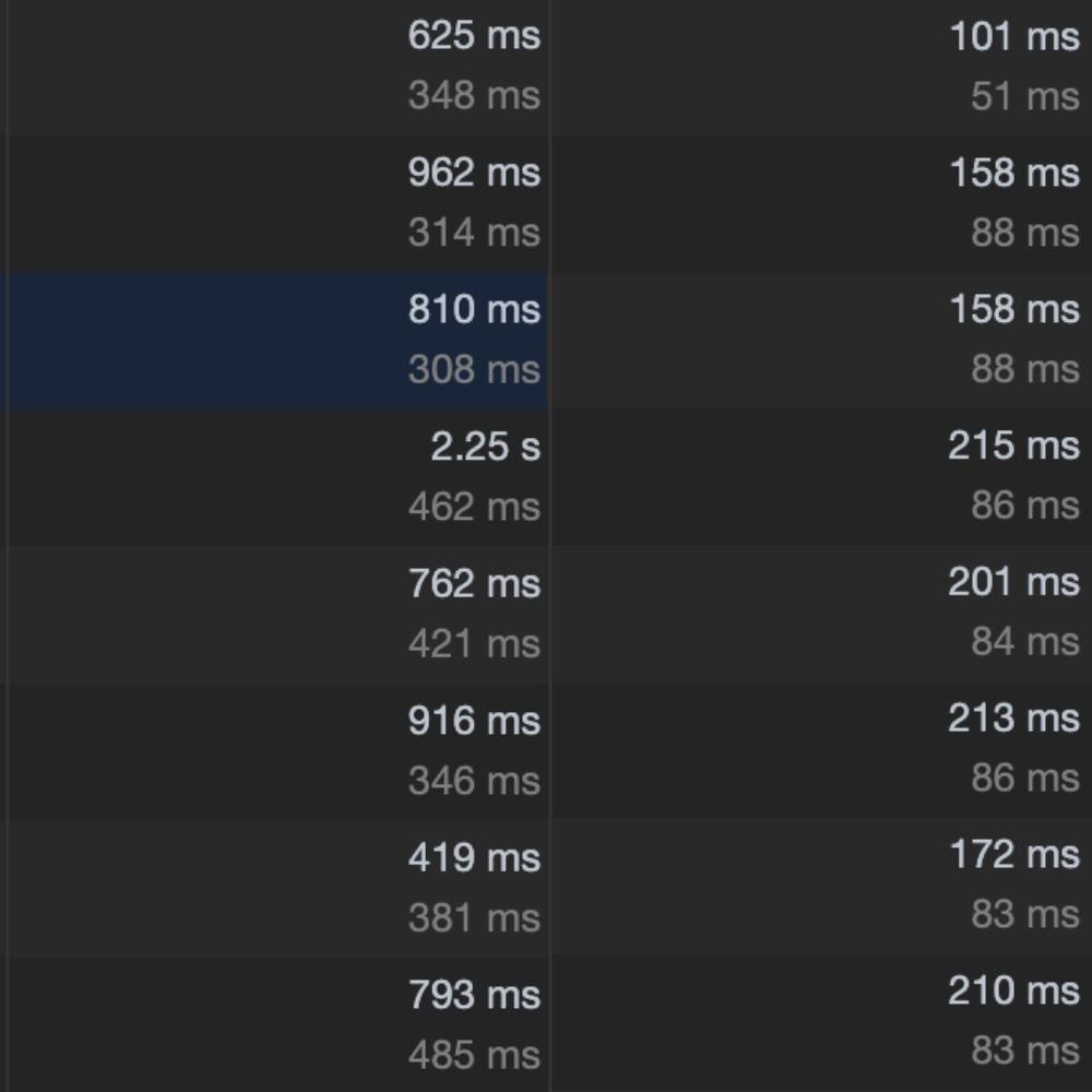
This is a comparison of load timings for images before and after the CDN. You can see that the images load between 2.3x to 10.4x faster than before. This comparison is for the same image size so the improvements should be much higher for mobile users who will now be shown lower resolution images than before.